Live presentations can be a bit awkward. Especially if it’s not something you do often. Unlike recorded videos, live presentations do not leave any room for error. Your audience is already watching you and you can’t scrap your presentation and start over.
If the presentation is live, you need to get it right the first time. So, what’s the biggest problem with giving live presentations?
The biggest problem may be as basic as getting your audience to pay attention.
An InterCall study showed that over 60% of people check their email or do other work during a conference call. Others confessed to eating and making food, checking their phones, and even exercising. If you want to keep your audiences engaged during your live presentation, keep reading.
Make yourself more visible.
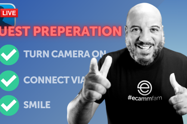
Whether you’re on camera, communicating in a meeting, or stage presenting, facial expressions are essential. It’s as relevant as the content of the presentation itself.
Here’s why: a study by Richard Franz showed that infants stared twice as long at faces when compared with shapes. In other words, if you want people to pay attention to you, make sure they see your face.
Also, remember that you can use your facial expressions to enhance your point, distract your audience or even confuse them. For example, research shows that you’re perceived to be conveying more sincere and intense emotions when people see wrinkles around your eyes.
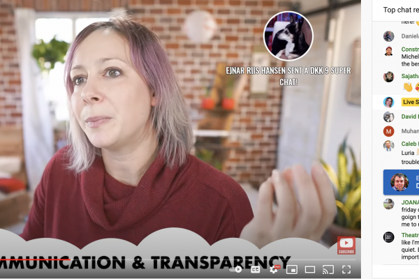
So you should spend time on your content creation to give a superb presentation. But you should also make yourself visible and show dynamism in your facial expressions. You can take a look at the example below.
In other words, if you say, “I’m thrilled about these new projects!” you should show your face to your audience, and your face better tells the same story.
Appreciate the pause
When you pause in your live presentation, it gives your audience time to process the information. But, equally relevant, it allows you to consider your message carefully. Also, ensure that your words convey what and how you want to say it.
It’s natural to talk too fast and quickly go through your presentation. Usually, people fill pauses with filler words like “um,” “ya know,” or “like,” or even “ah.” But these words can have a devastating effect on your audience.
Apart from fillers being annoying, they can leave your audience with the impression that you lack confidence or are nervous. Maybe that’s true? Take a cue from the renowned public speaker and author Brian Tracy and leverage the power of the pause.
But if you often pause, instead of “um,” you can add more credibility to your message, aside from being seen as confident.
Get started on time
Many presentations exceed the appointed time because they started late. But always remember that you never have as much time as you want. That’s usually because the meeting organizer or presenter has decided to wait for latecomers. That can leave the early comers waiting and probably frustrated.
On the other hand, some people don’t see why the early comers should be penalized by waiting for the latecomers. But you may also have concerns that those who are late may miss some vital information.
In such a situation, don’t do the most important parts of the presentation first. Instead, start with an engaging yet relevant story that leads to your first main point. However, the story should be relevant to the topic.
Make a plan for interaction.
It’s essential to keep your audience engaged for as long as possible since the average focused attention span of humans is around five minutes. One of the best ways to do that is to plan for interactions.
There are numerous types of interactions like asking your audience questions about your products, white-boarding sessions, or polls. With tools like Ecamm Live, you can even pull Facebook or YouTube comments from your live presentation right into the presentation.
Regardless of the form of interaction you choose, plan and prepare adequately before the presentation.
Also, make your presentation simple, clean, and not too fussy. It should be a straightforward presentation, so it doesn’t distract or overwhelm your audience. Otherwise, the attention span will considerably decrease, causing your audience to ignore you entirely.
Phil Waknell in his TEDx talk spoke about the three ingredients of a successful presentation and how to weave these ingredients for maximum interaction.
If you have a good sense of humor, you can use that to lighten the mood and create a good rapport with your audience. In addition, there’s a high chance your audience will remember you if you make them laugh. That will help them to remember your key points and ideas.
Reiterate crucial concepts.
Repetition helps your audience remember. When you reemphasize vital concepts, you can create a lasting impact on your audience.
So it’s advisable to state and reference your key points many times during the presentation. You can start by presenting at the start, then reiterate the points in the main part and reemphasize them very clearly at the end.
If you make sure that all your presentation is essential to the message and link any point back to it, your audience has a higher chance of remembering it.
Make your slides simple.
Every live presentation platform has its distinctive approach to displaying slides. However, you should avoid technical troubles by designing simple, easy-to-read slides.
It’s ideal for placing text in the center of the slides instead of the edges because they may not show correctly on your audience’s screens. Also, it’s better to create high contrast slides because it makes it easy to read for your audience.
As said earlier, it’s more likely that your listeners get distracted or multitask. So you need to get your main message across as fast as possible. To do this, use a sentence headline for your slide titles that outlines your slide’s main points. You can then include the details of each key point in the body of the slide.
Also, multiple lines of text and photos may work well on a large desktop monitor or a slide being watched in a conference room. But that won’t be the same for a smartphone. So, as a general rule, always stick to one point per slide. An excellent example is Pat Flynn’s presentation, well, on slide design.
It becomes even more critical when the presentation is scaled to a smaller screen. So, even though you have to keep the slides short, you may have to use multiple slides. That way, your audience won’t struggle to see the image or read the texts.
Here’s an example:
Here’s how when viewed on a mobile device:
Below are the revised slides for viewing on smaller screens:
Looking at the round of last slides, it’s clear to see which of these two makes for a better presentation.
Use Visual Aids
Visuals are highly essential because they can enhance your audience’s understanding of a topic, explain technical points, make an impact and create enthusiasm. The type of visual aids to use depends on your purpose. For example, maybe you want to:
- Summarize information
- Clearly define and show examples
- Emphasize what you’re saying
- Make a memorable point
- Make something simple for your audience to understand
- Aim for an impact. For example, you may show images of the effects of smoking. But, you need to know what type of impact you want to make. Do you want your audience to be sad, happy, angry?
Select your visual aids strategically so that they can have the maximum appeal to your audience. That means searching for images your audiences will: relate to, find familiar, and they’ll like.
Also, consider the style of visual aid that is perfect for your audience. For example, is the live presentation formal or informal? Will you touch on severe or sensitive issues? Can you be humorous? If you do it right, you can create a lasting memory in the minds of your audience.
You should maintain your audience’s concentration during your live presentation by applying these tips. Also, you should use the right tools to present to help you deliver. The last thing you want is to bore your audience to death.
Wrapping Up
Presentation expert Clif Atkinson recalls an education conference where two speakers got entirely different reactions from their listeners. The first speaker began with an interactive exercise and was, overall, entertaining; the audience loved the presentation.
The second speaker, however, started with a more traditional PowerPoint. He bored his audience to the extent they started critiquing his content, slides, among others, on Twitter.
At the end of the keynote, they made a t-shirt that read, “I survived the #thewebkeynote.”
So, what’s the point? All this is to say that you shouldn’t aim for engagement for engagement’s sake but create an interaction that gets your audience to embrace your ideas in your live presentations.
Bear that in mind and your audience will love you onstage or in front of the camera.
This article was written and contributed by Dave Rogenmoser.
Dave Rogenmoser is the CEO and co-founder of Jasper.ai, a Y Combinator-backed startup that helps companies write marketing copy that converts. Jasper.ai has helped more than 26,000 companies increase website conversions using AI.


